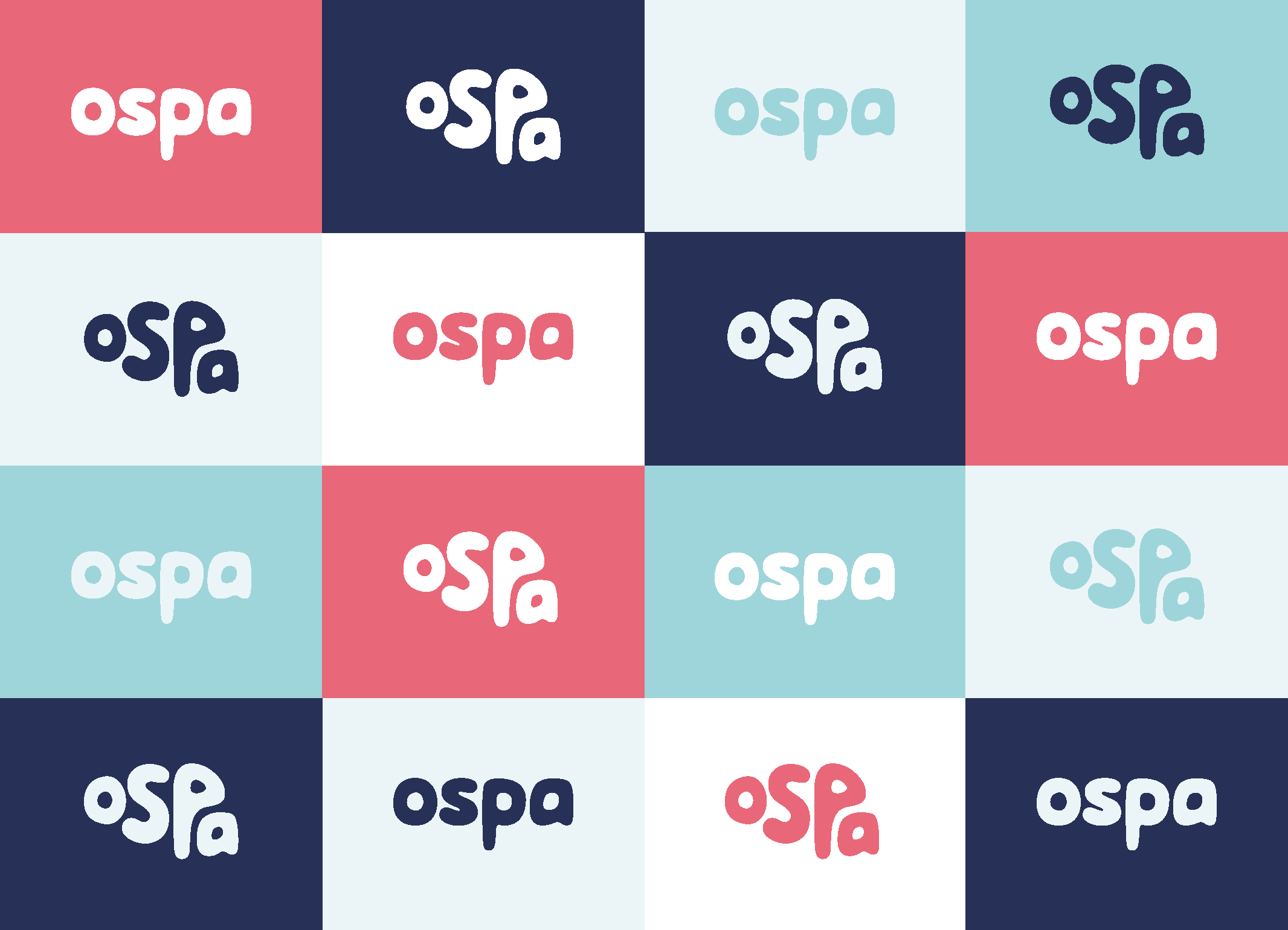
Ospa is a brand new platform designed to improve mental health in the workplace.
I designed their brand identity, website and promotional video, ready for their launch. With the focus on improving mental health, the brain shape conveys this simply and effectively. The sea is vey calming, and using shades of blue, alongside the main coral colour pop, gives the brand an approachable yet calm feel. It had to be engaging and enjoyable with a positive look, balancing the need for.


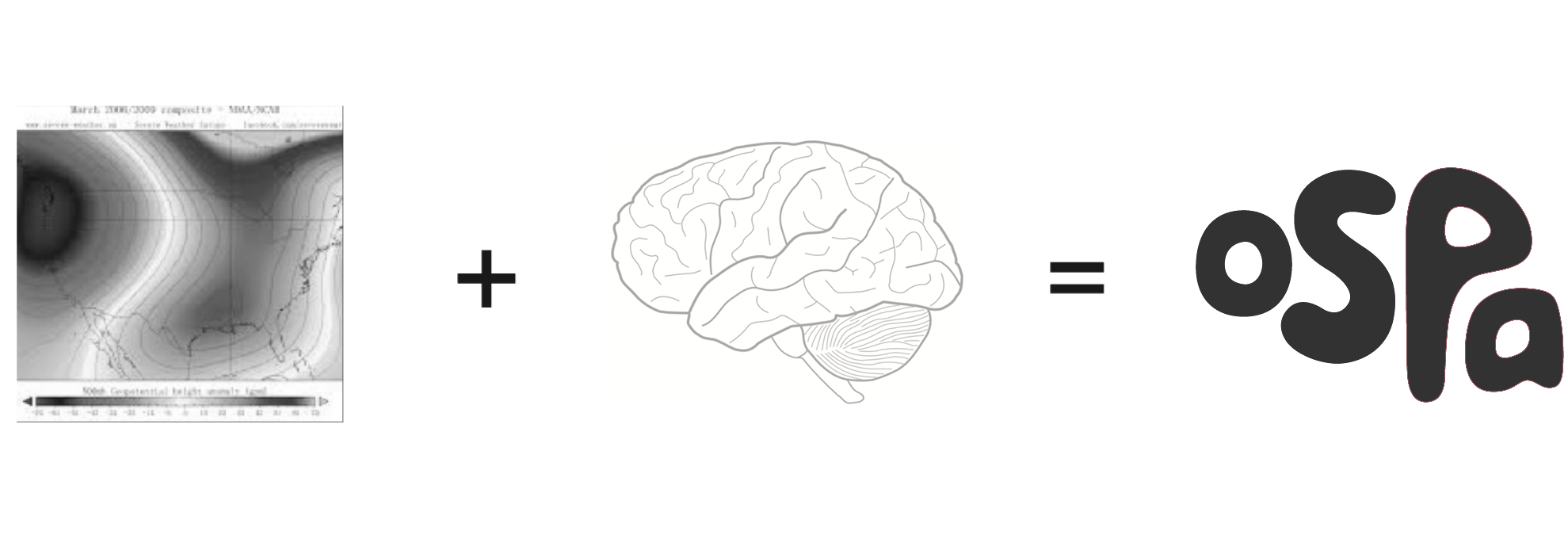
Combining the idea of weather patterns and how they change, like our emotions and mental and physical health, with the shape of the brain and the name create a recognisable logo icon.

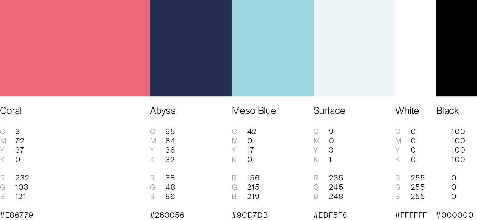
The colour scheme, inspired by the sea, uses a bright Coral alongside a set of Blue tones that evoke the calmness of the sea.


Illustrator Evgenia Makarova was commissioned to create all illustrations
A short explainer video to quickly demonstrate how Ospa works.

The website was designed to inform CEO’s and HR Managers of the benefits to signing-up their company to Ospa. With a clear layout and use of playful illustrations, the design quickly conveys the core principles of Ospa, with the option to sign up at the bottom of the page.
